A fun way to represent the Graphic Designers perspective towards Client Servicing Executives. The Communication between them is whacky and hard to swallow. Check out these examples that Graphic Designers wish they did not hear.
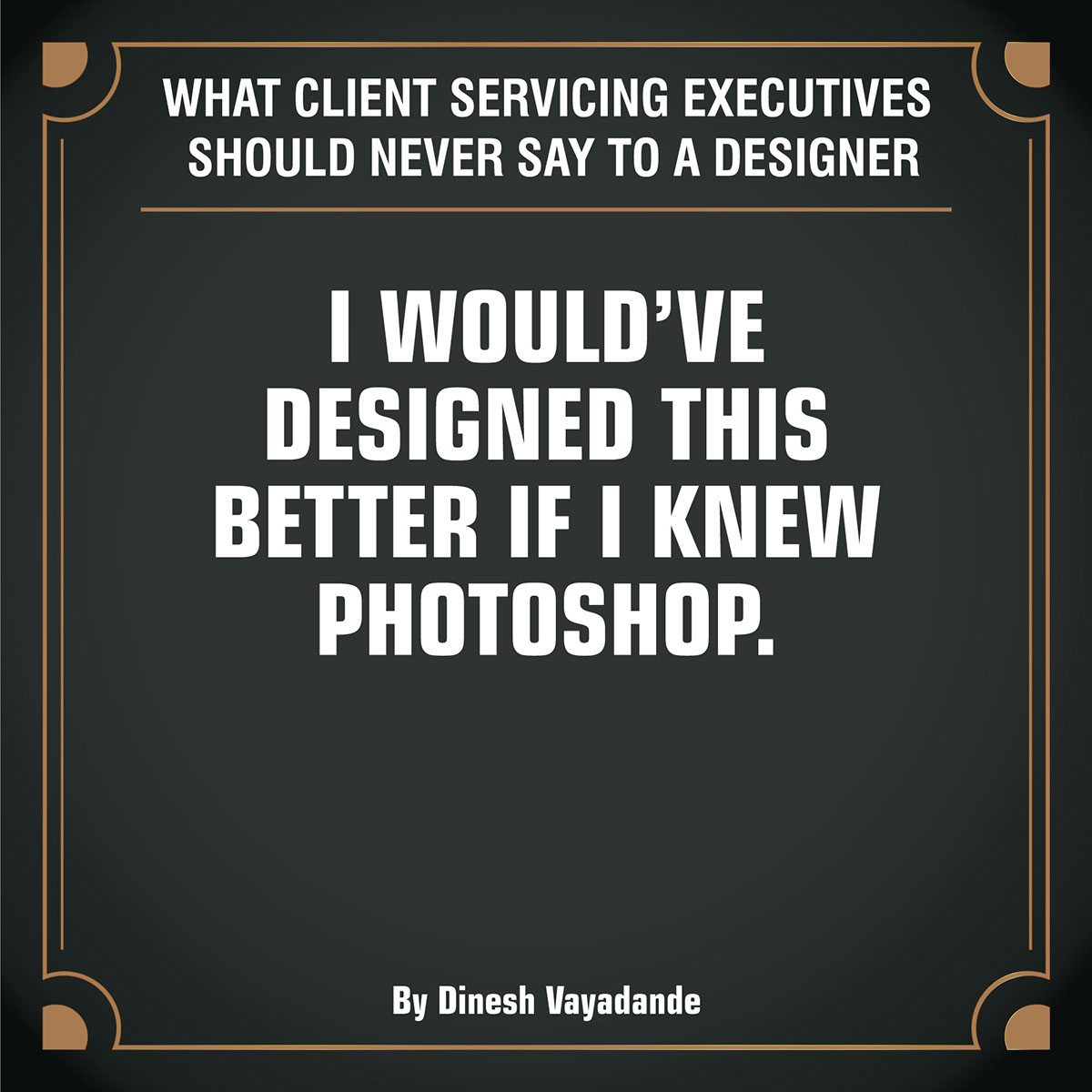
I would have designed this better if I knew Photoshop
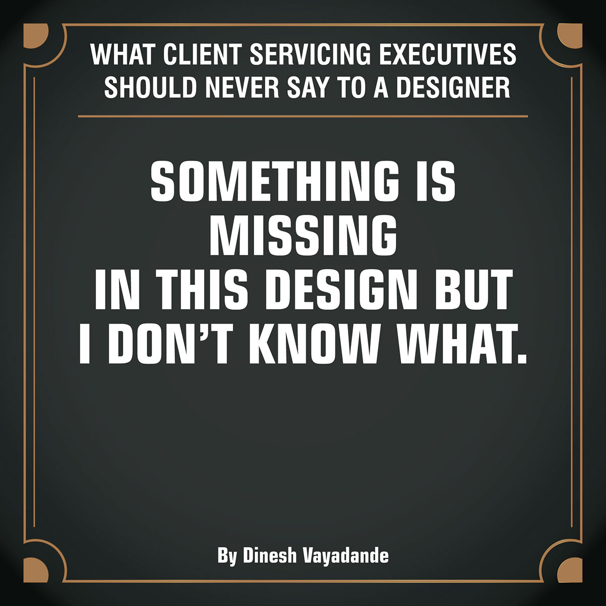
Something is missing in this design but I don’t know what
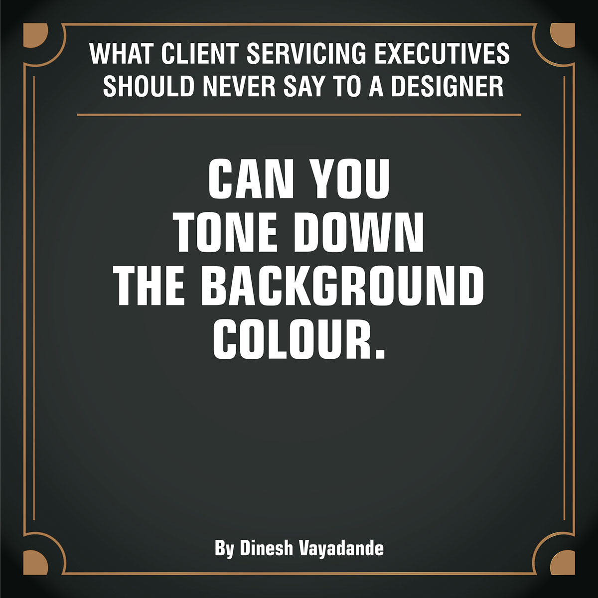
Can you tone down the background color
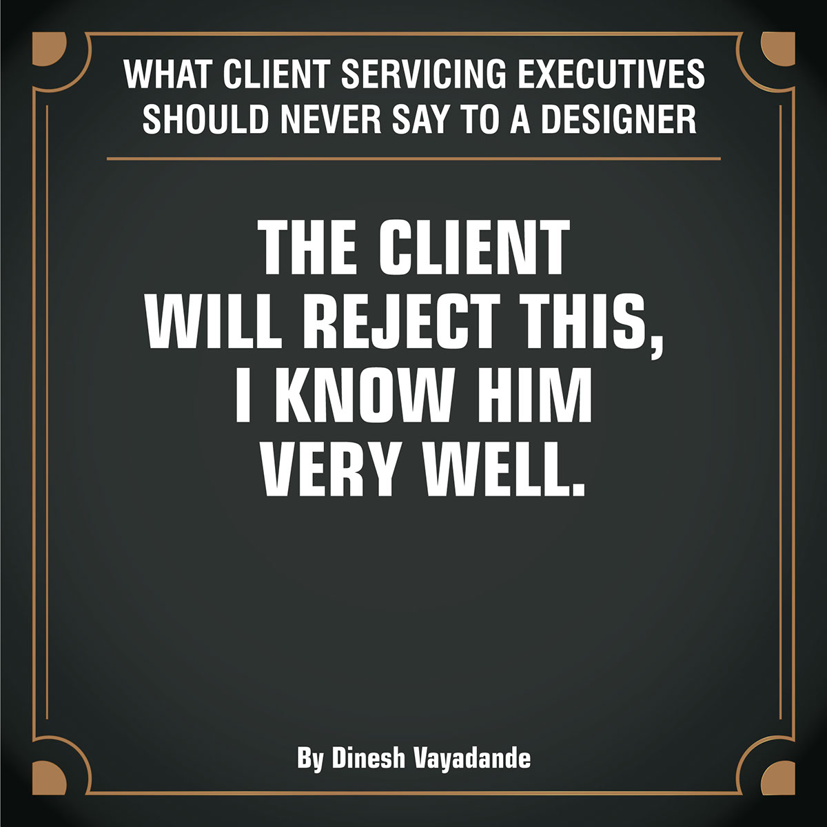
The client will reject this, I know him very well
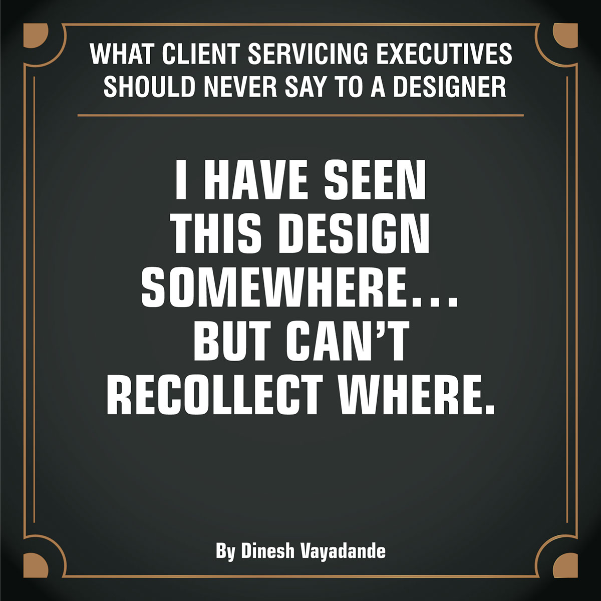
I have seen this design somewhere…
But can’t recollect where
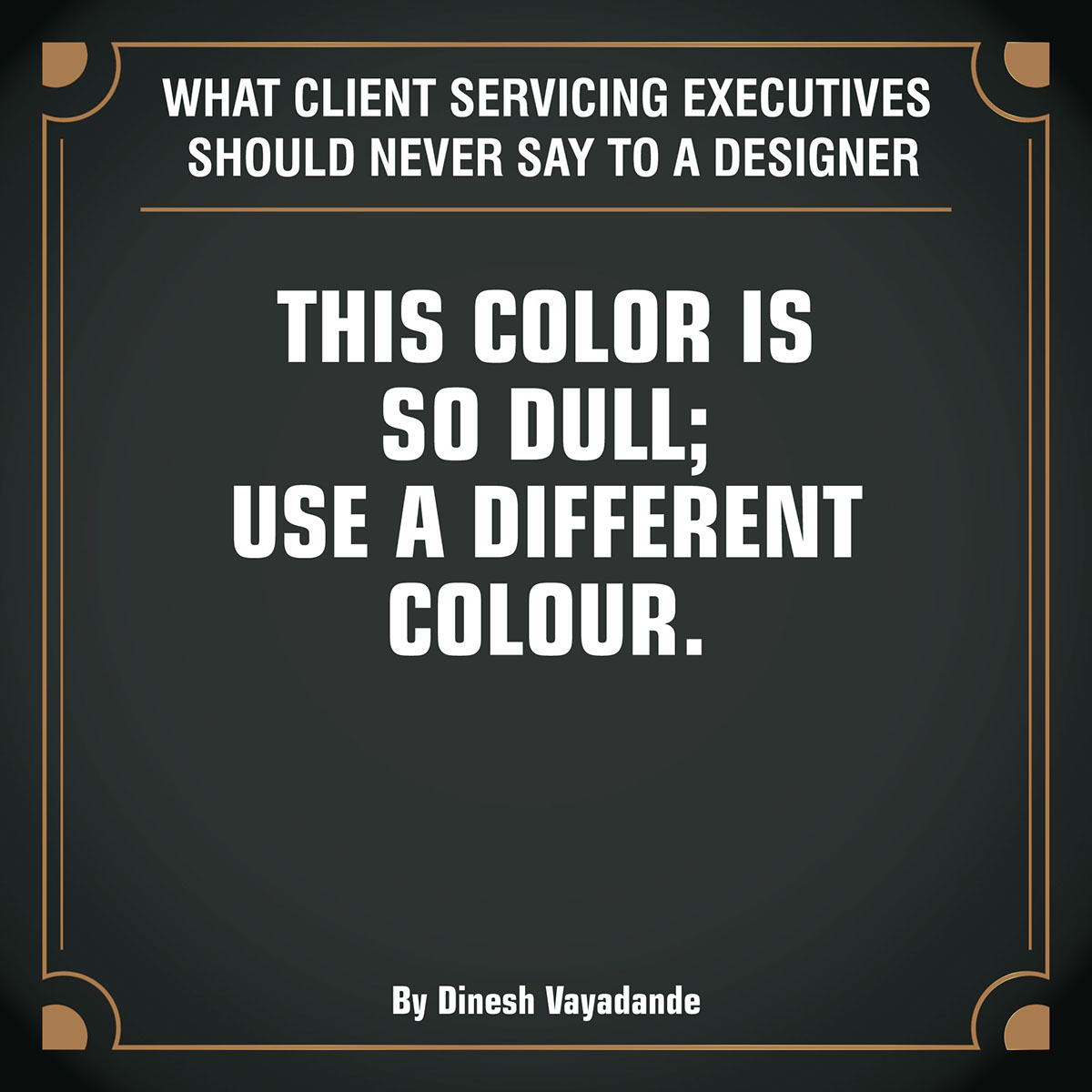
The color is so dull; Use a different color
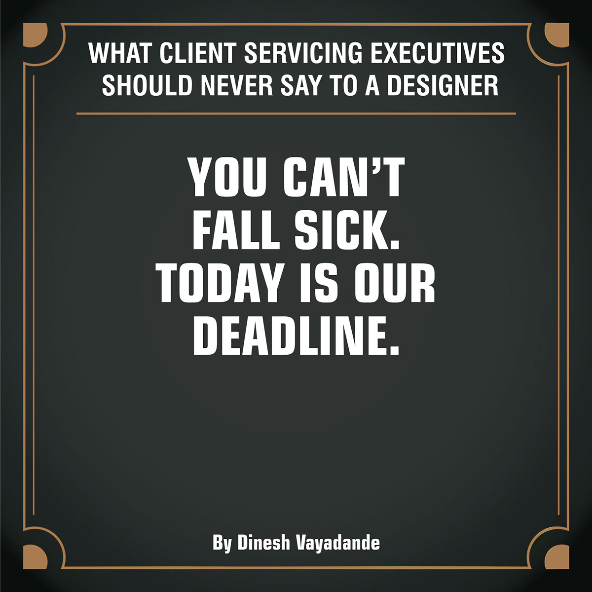
You can’t fall sick. Today is our deadline.
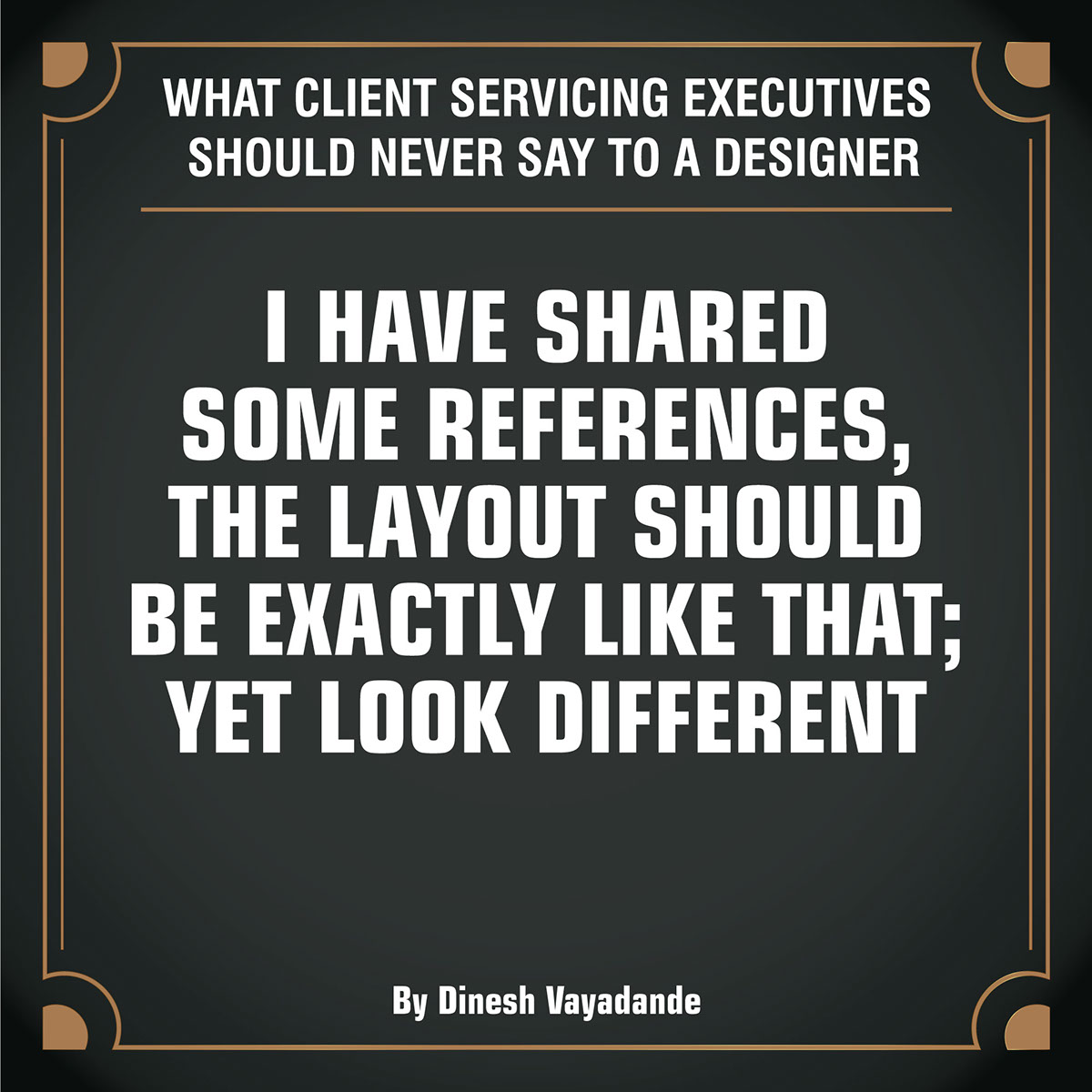
I have shared some references, the layout should be exactly like that; yet look different

The white is not bright enough; can we use a brighter color.
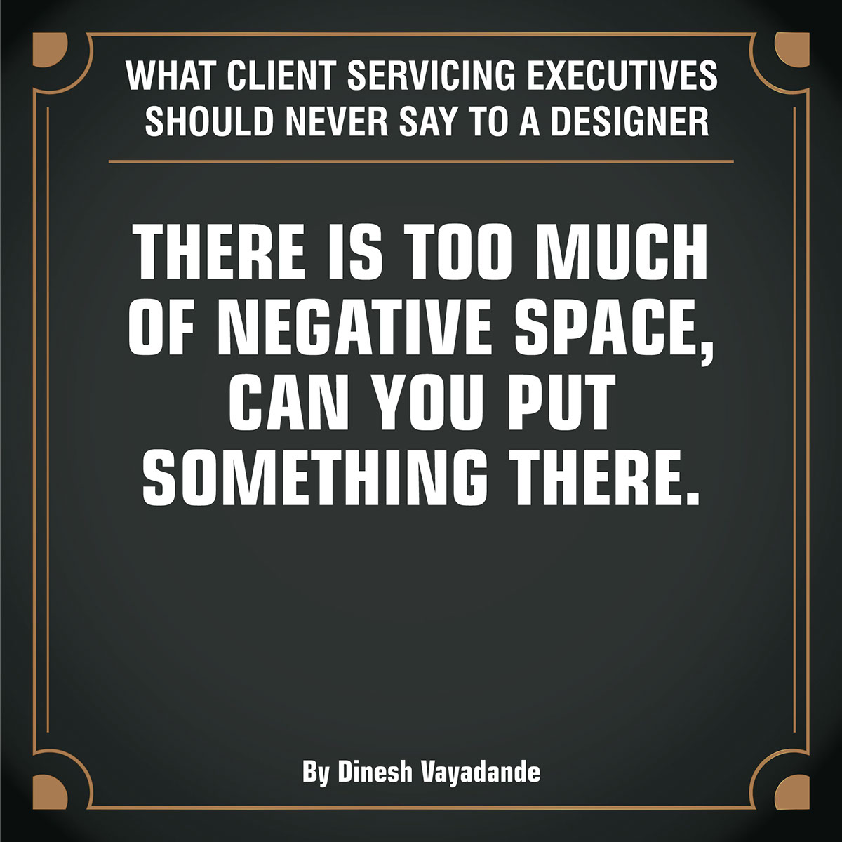
There is too much of negative space,
can you put something there
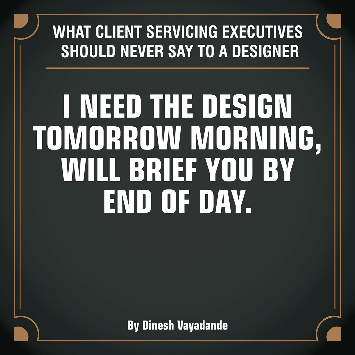
I need the design tomorrow morning,
will brief you by end of day.
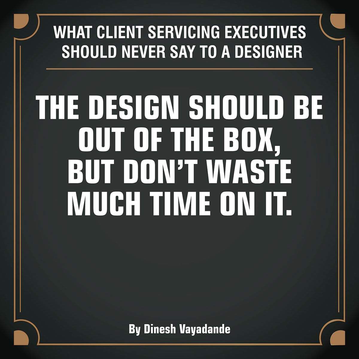
The design should be out of the box,
but don’t waste much time on it
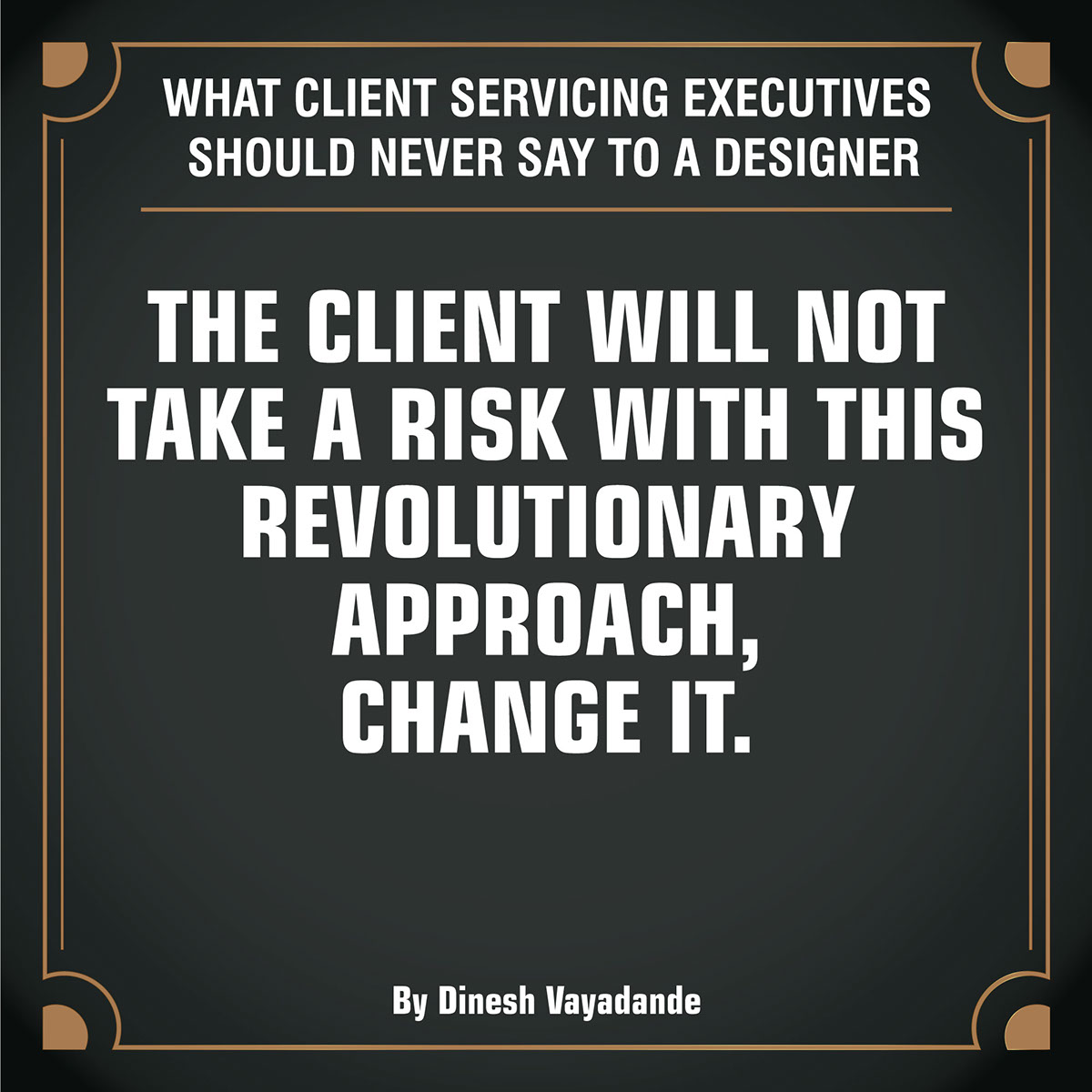
The client will not take a risk
with this revolutionary approach, change it.
Follow my page: https://www.facebook.com/designburp/
