UBER, one of the well-known multinational transportation network companies, offers services such as peer-to-peer ride-sharing, ride service hailing, food delivery, and
a bicycle-sharing system. It has made transportation comparatively easier to find especially on hard-to commute days such as strikes, monsoons, and so on. Moreover, it has also managed to bring about a huge change in the Indian market, both financially and about usability
i.e. it’s a user-friendly app.
As a frequent UBER user, I feel that they’ve done a commendable job in helping people transport effortlessly but when it comes to offering a convenient user experience. However, there are a few glitches that I feel need to be addressed. For example, while booking my ride, the payment method mentioned or given to users includes cards, UPI or Net banking – since it is easier and faster to make the payment of the exact amount.
Once the ride is complete, if I have opted for the ‘pay by Card method’, I often forget to complete my payment at that moment even though UBER notifies me about reaching my destination. Thereafter, when I plan on booking another ride for a different destination, I am asked to give the previous driver his ratings rather than complete my pending payment.
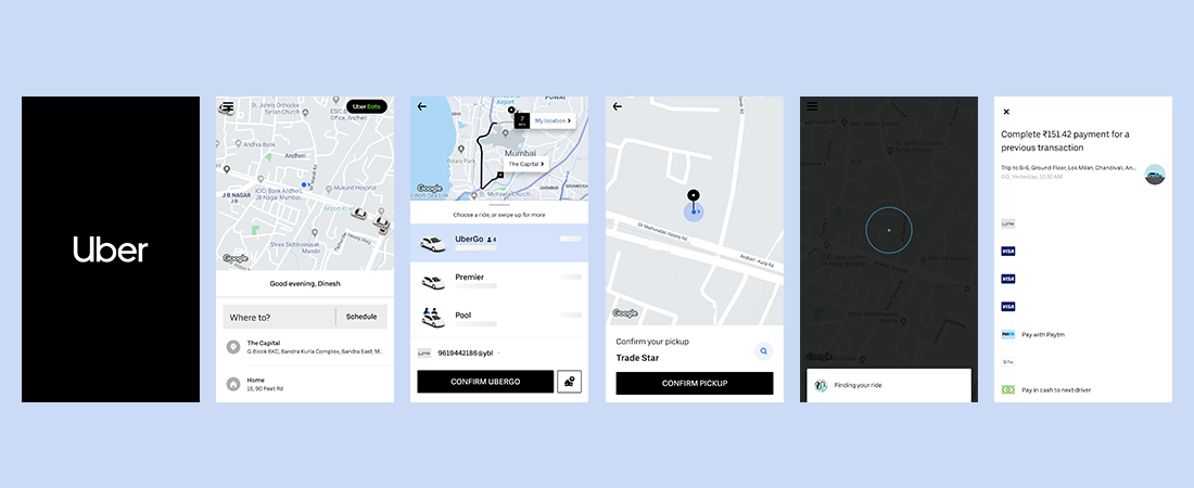
To make it easier to understand, here are the steps that I follow once I have given a rating:
Step 1: Enter Drop Location
Step 2: Edit Pick Up location (if the GPS doesn’t auto-input the location)
Step 3: Choose my UBER Ride
Step 4: Finding My Ride
 UBER starts finding the nearest driver to me, but before it can show me the driver details, the ‘pending payment screen’ pops up at once. Such an instance requires me to go through four different screens to book a ride, while in the end, it displays the payment screen.
What I am trying to imply here is that to prevent the hassle of opening four different screens, UBER could’ve easily notified me to make payments and then proceed further. As a customer, and after gauging the feedback of my fellow UBER customers, there are plenty who feel the same. Due to this little glitch, there may be multiple users who have left the process halfway. Instead of freezing the user’s booking process at that moment, UBER can allow a pop-up or a CTA such as SKIP or Make Payment Now/Pay to Next Driver. Such options can save a user time and effort while making it quicker to book a ride.
Although, while this is my personal opinion, if UBER preaches that its best interest lies in its customers, then finding ways to enhance customer satisfaction or a user experience should become their number one priority.


