Millions of students worldwide were stuck with their research
for pursuing higher education. With the COVID-19 lockdown, higher education fairs were stalled and virtual events caught students’ attention.
To comply with my confidentiality agreement I have not included any confidential information.
Project Brief
Outline a plan which focuses on improving traffic volumes to Regional Event landing pages.
Execute quick wins actions which positively impact the acquisition of traffic.
My Role & Responsibilities
Connected with the stakeholders to understand the business requirement, goals, problems, and outcome of the project.
User interviews were scheduled and conducted by our UX Research Team where I observed the users and took notes.
The collaborative findings and insights exercise was conducted and all the research material was collated on Miro Board.
Quantitative data was gathered and analysed from the available sources and funnel flow was intensively analysed.
Collaboration with the SEO team to enhance the page search and understand the technical analysis report
Connect with the UI Team to create mocks to align the design with the data captured to make informed decisions
Prioritisation and Implementation of ideas, later optimising as per performance
Analyse and share the outcome report with the stakeholders on a month-on-month basis.
Enhance and optimise the page as per the data captured
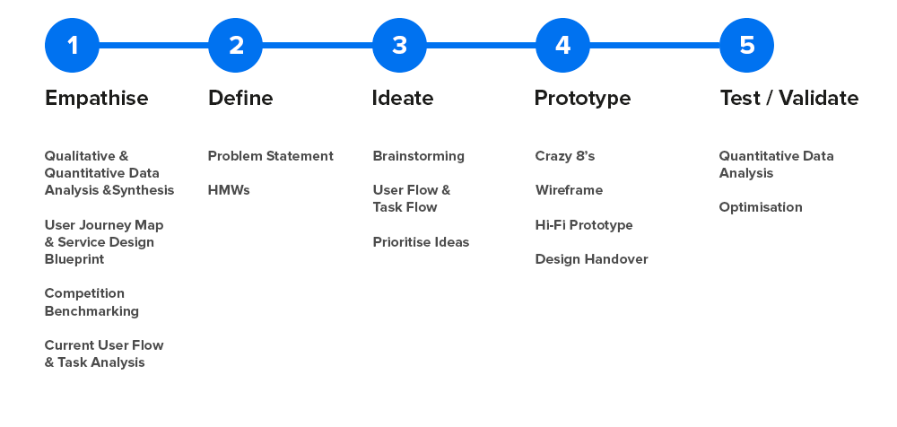
Design Process Discovery
- Teamed up with User Researcher for User Interviews and took notes
- Analysed and Synthesised data through an Empathy Mapping exercise
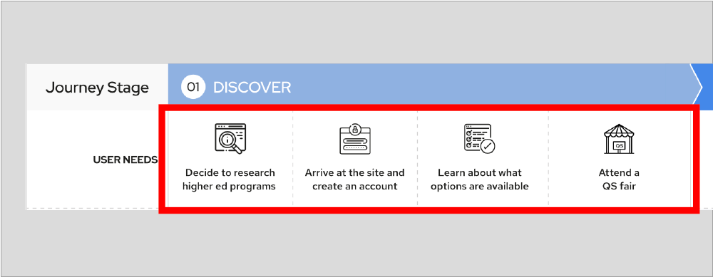
- Identified Users, Scenario, Needs, Problems and Opportunities across User Journey stages
- Line of Visibility / Touch points through the user flow
- Line of Internal Interaction – Activities performed internally at every stage
- Captured the backend activities
Analysed user needs, motivation, problems, emotions and opportunities through their higher education research journey.
Discovered weaknesses in the internal process and alignment with the user touch-points. Also, identified cross-team dependencies at each stage.
- Went through competitors – Created User flow and Task Analysis report
- Examined current user flow and task flow
- Captured the insights through Information Architecture, Findability and Discoverability
- Created insight reports based on the heatmaps, attention maps and scroll map
- Dug data from Google Analytics to find out the behavioural data of the users
- Listed the Google search results from the top 10 traffic acquiring countries
The data showed that fewer users are landing on the Events page through organic traffic. The discovery stage was affected in the user journey due to information findability.
Ideation
- Analysed the data and presented it to the stakeholders
- We were able to collaboratively come up with ideas through problem statements and HMWs
- The ideas were prioritised as per the impact-effort matrix
The ideas were then converted into tasks.
- We identified the Top 200 Rankings pages of the website and implemented banners that could bring traffic to the Top Universities – Events Landing Page
- Proposed Google Search Results Sitelinks to the SEO team
- Placed MBA And Masters Events on Chatbot to drive traffic
- Conducted A/B testing on the Events Landing page
- Created Top Navigation based on Location Specific Events pages
- Quick Wins and Revamp of Events Landing Page and the Registration Process.
Implementation
- Based on the prioritisation, the UX team created designs and shared it across for implementation
- We continuously collaborated with the Development Team for the implementation of ideas
Designs were created and shared with the development team.
Optimisation
- Shared reports with the stakeholders on a month-on-month basis
- Optimised and experimented with the design based on insights captured
- Collaborated with the stakeholders to share new ideas – prioritisation and implementation
Data were analysed and shared with the stakeholders.
Appropriate decisions were taken as per the data.
Outcome/Insights

TASK 1:
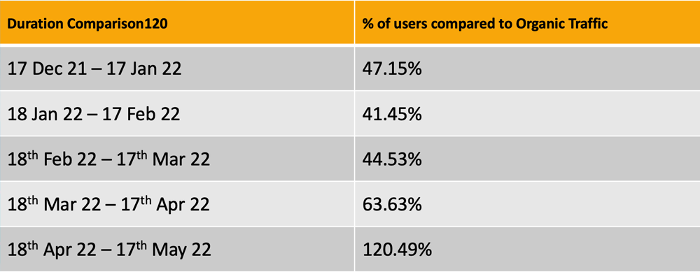
We identified the Top 200 Rankings pages of the website and implemented banners that could bring traffic to the Top Universities – Events Landing Page
Compared to the organic traffic we acquired a lot of users to the Events, Landing Page. Let’s have a look at the data on a month-on-month basis.
TASK 2:
Proposed Google Search Results Sitelinks to the SEO team
Analysed 10 Top Most countries of traffic and checked the search results for QS Top Universities Sitelinks. We found that Events were not seen on the site links on any of the search results on Google. 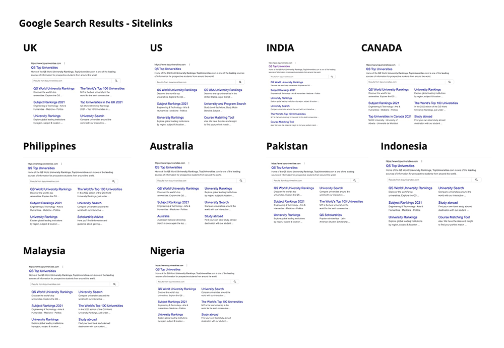
Requested the SEO team to include the Events in the Sitelinks to make the events discoverable on Google.
TASK 3:
Placed MBA And Masters Events on Chatbot to drive traffic
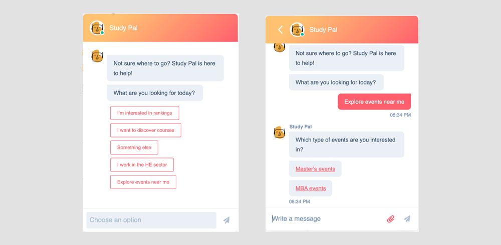
We were successful in acquiring a lot of users through chatbot as Events Option was upfront on Study Pal.
TASK 4:
Ran an A/B testing experiment on the Events page.
We created 2 variations of the same design to experiment with the behaviour of the users on both the designs.
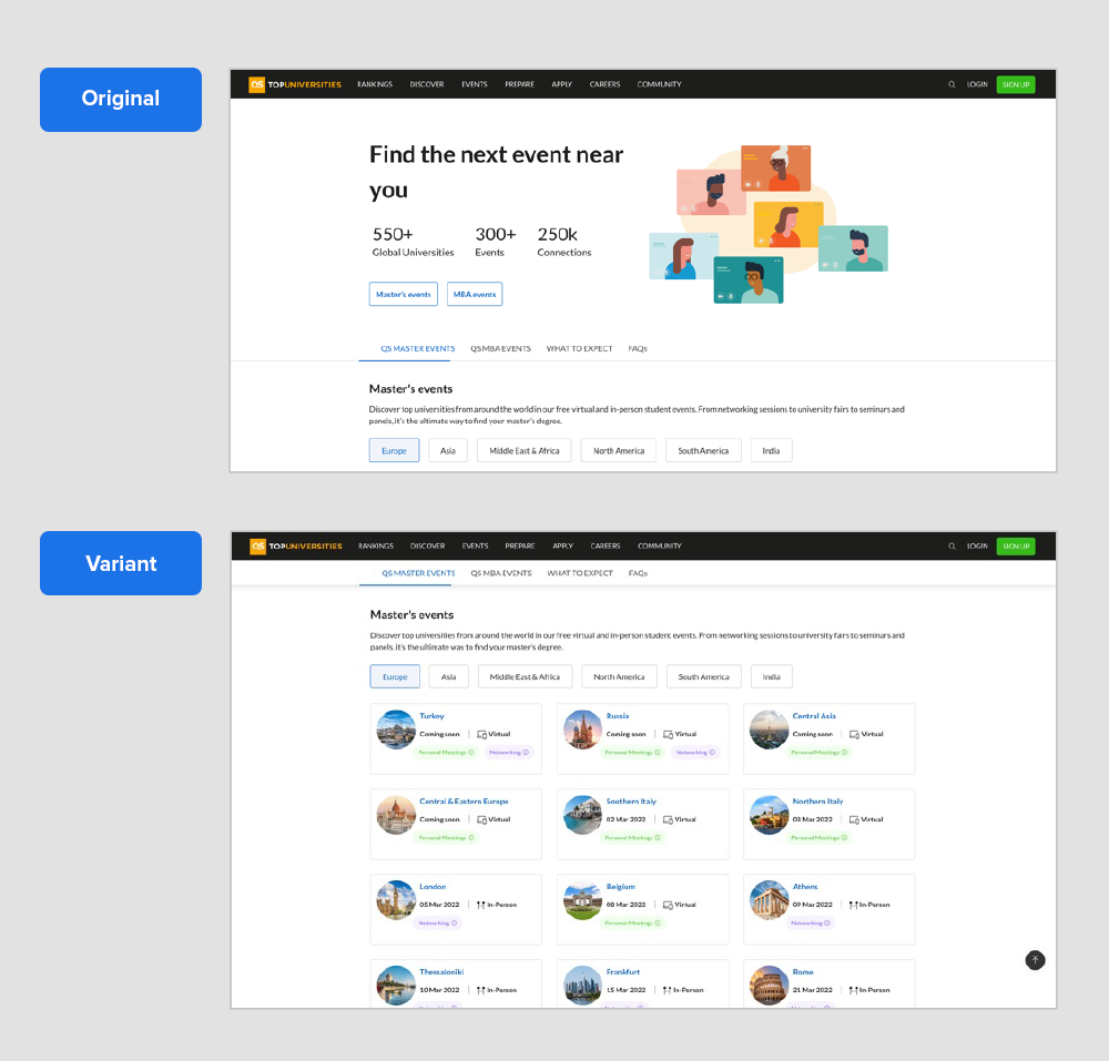
The goal was to:
a.Identify which option would work better while discovering information
b.How do users engage and click on elements
c.Time spent by the users on the page
The outcome of the AB Test:
- Original works better than the variant
2. The CTAs anchor link on the banner worked better while discovering info
3. Students unaware of registering for events based on their location
4. Users scrolled deeper in the original version looking up more info
5. Users clicking on the text below Master and MBA events expect more content
6. Users spent more time on the original version than on the variant
7. There were an almost equal number of visitors and clicks on both the versions
8. On both versions– people spent more time on FAQs
9. Events cards got more attention in the Original version
TASK 5:
Created Top Navigation based on Location Specific Events pages
The top navigation for events was revised considering the SEO and also the findability of the events based on the location of the user.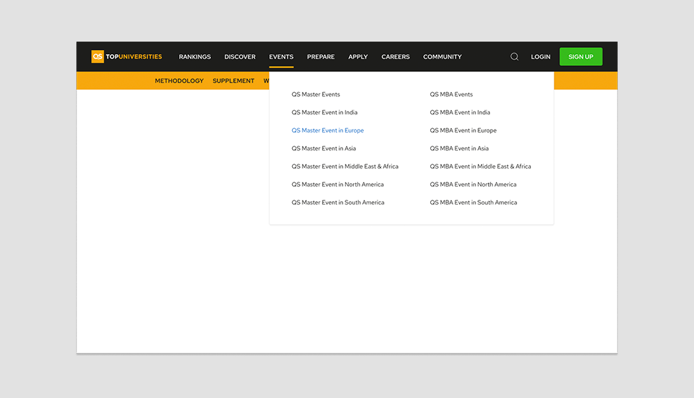
For better findability of the MBA & Masters Events. We introduced an anchor tab in the landing page design so the information would be easily discoverable by the users.
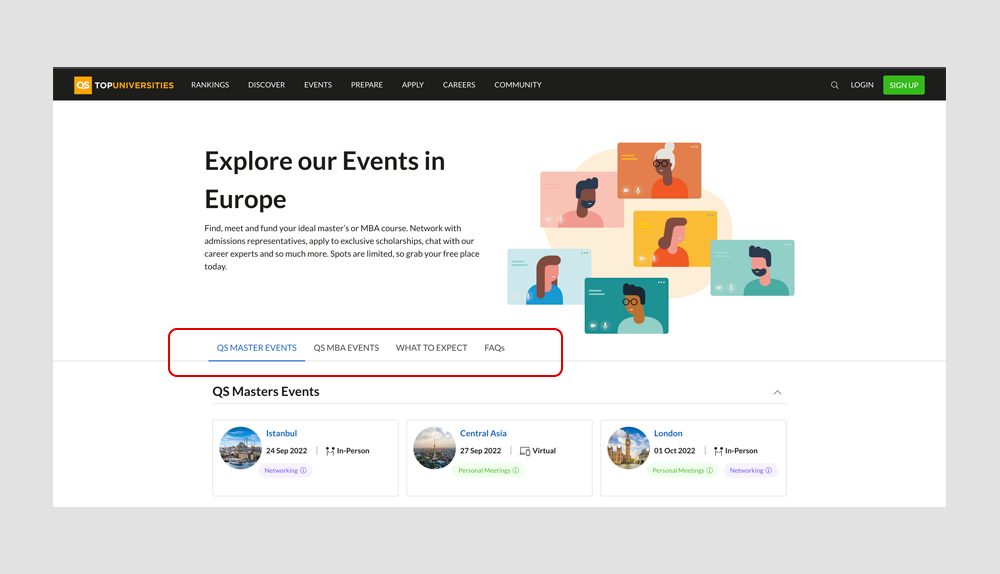
We are continuously analysing the data and optimising by running experiments for creating seamless user experience.
