Home Loan journey transformed into
an interactive and engaging experience. Empowering people to make decisions with a few simple steps can make life more comfortable through the digitised process.
To comply with my confidentiality agreement I have eliminated and reserved confidential information. The designs are a reinterpretation
of the original.
The Project
The client is one of the leading banks in India. We were asked to redesign their website and create an online journey where users would be able to look for information and apply for the loan online. As a Home loan division, they have various services which meet users financial needs.
My Role
I was part of the pitch team and responsible for the User Experience and design strategy for desktop as well as mobile. I was solely handling the User Research, producing all major deliverable from research to presenting it to the client (until the website went live). I worked alongside a copy strategist, content writers and the product managers which helped us to build communicative and engaging tools for the users.
• User Research • Prototyping • User Interface (UI) Design • Testing
Business Objective
Introduce an interactive tool which can resolve user queries online and could reduce the bank visitors and less paperwork. Digitising the process of home loan and helping users with their end-to-end requirement.
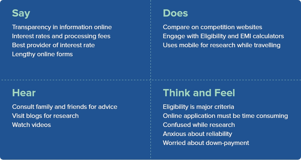
User Interviews And Survey
We conducted qualitative research and interviewed 15 people who already have a home loan and those who might opt for a home loan in the future.
We also conducted quantitative research and rolled out the survey to 80 people and mapped the insights.
Online Research
Through Google Keyword Planner we were able to understand the factors that users look for: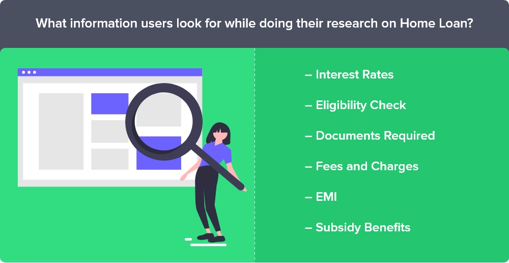
Industry Insights
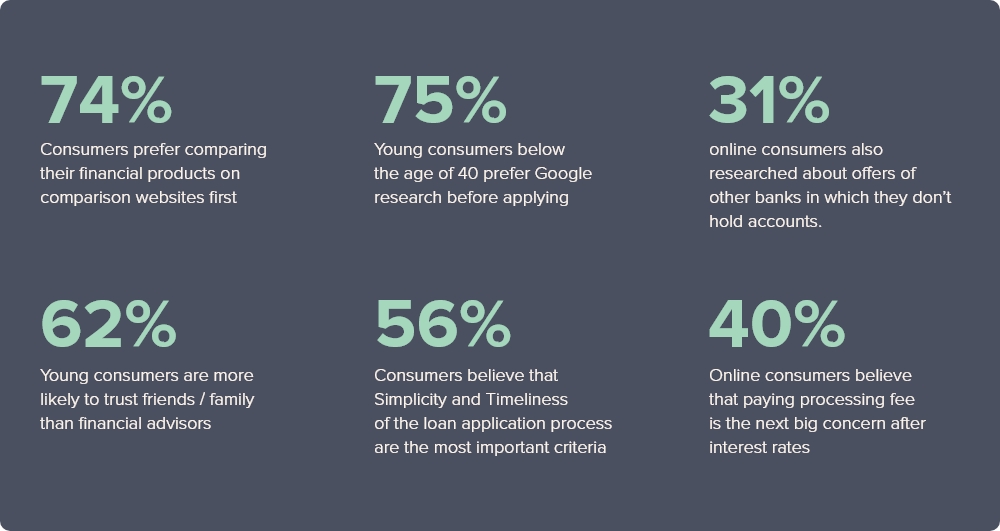
This is a customer insight report that was released by BankBazaar.com. The report emphasizes on the shift in consumer mindsets from traditional buying habits to faster and easily accessible online portals. Below are some of the statistics taken from the report.
User Problems
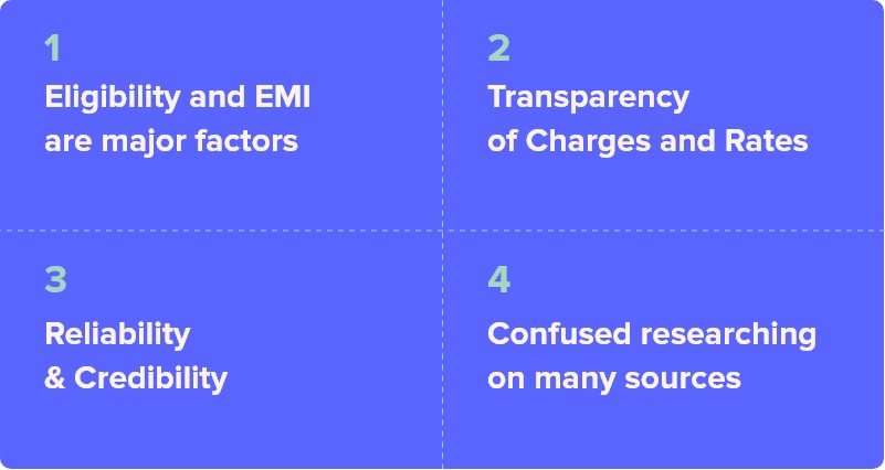
How Might We
How might we help the user to find the related information
How might we help the user to know the EMI amount they will be paying
How might we help the user to know if they are eligible for a home loan
How might we create a case if the user is looking for more amount
How might we create an experience where the user can apply for the home loan online
How might we identify the users profile (salaried / self-employed) and show relevant information
Approach
We decided structuring the navigation tabs as there are many products involved under Home Loans like Balance Transfer, Loan Against Property, etc. This helped us bringing together relevant products under related categories and simplifying the discoverability aspect.
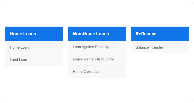
This helped in further understanding the Navigation and Sub-Navigation structure of the flow
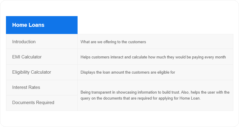
Prototype
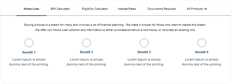
Navigation – All the information is placed upfront and it is easily findable
Content – The Introduction paragraph will help in understanding the features and benefits
Mapping the User Need with Products
We planned to create a interactive experience for the user where we can map the user needs with the banking products. The user will be able to find all the necessary information at one place. We listed down the list of questions that would be necessary for the Eligibility and EMI calculation and mix them both to create a customer journey for home loan application process.
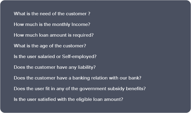
Introducing Natural Language Forms
Instead of traditional slider calculator format on most of the competition websites, we decided to take an unconventional approach which can meet the customer and business needs.
We framed the questions keeping the users at the first place. We designed the prototype and tested the initial design with the users.
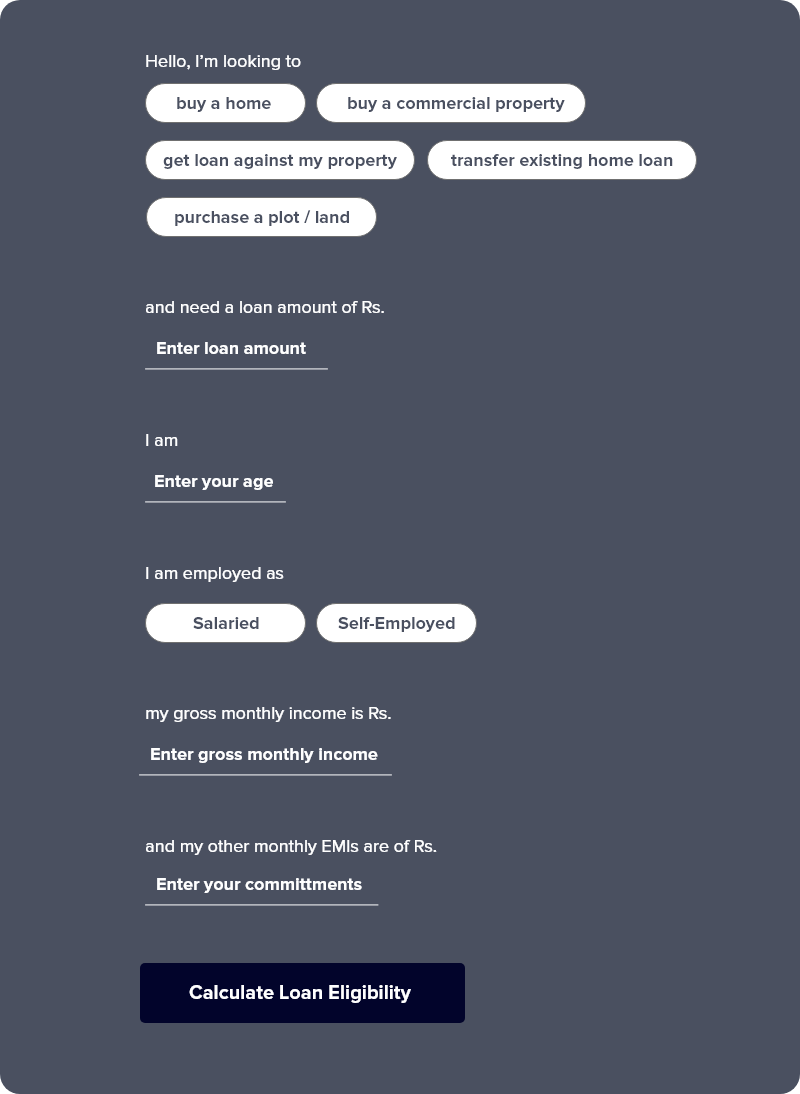
Customer Interaction Tool – Eligibility Calculator (Hero Concept)
After analyzing the behavior with the users, we optimized and iterated the design.
We designed the Natural Processing Form in a progressive manner i.e. when the user starts filling up the information the questions keep populatingThe wireframe link: https://adobe.ly/3bwuHY1
You can check the live version here: https://bit.ly/3jO7SlB
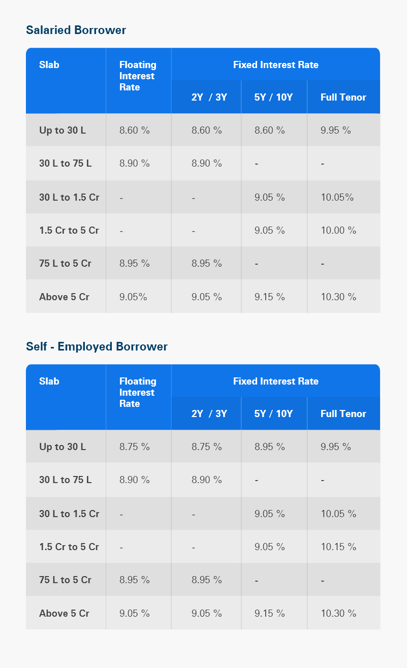
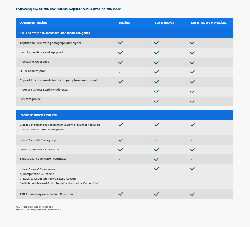
Interest Rates Information
Achievements
Provided a interactive platform for the users to find all the answers for Home Loan
Healthy and increase in traffic growth after launch
Heatmaps and Session recording helped in validating the users interaction
Users were able to navigate and find relevant information with less efforts
