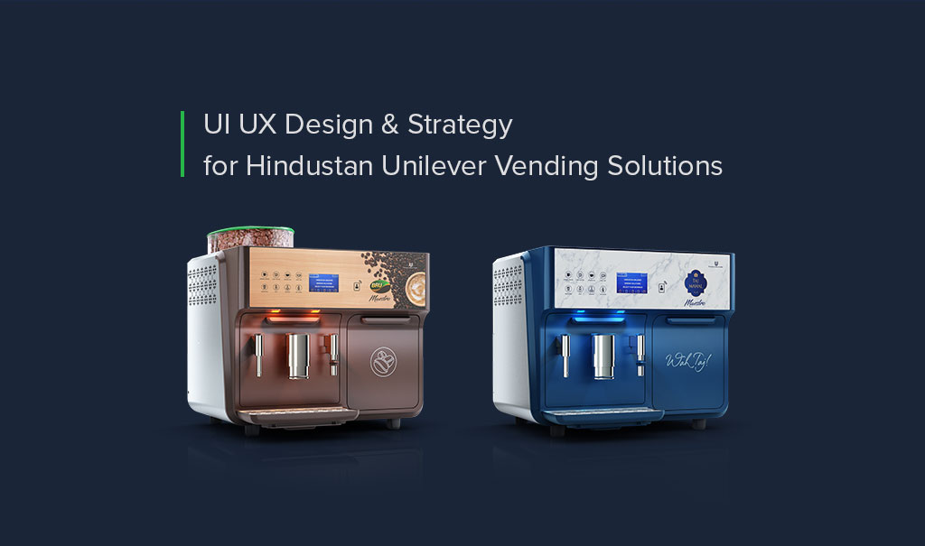
An efficient beverage vending machine is a necessity for every corporate set-up
HUL Vending Solution has recently launched an intelligent beverage vending dispenser called Maestro. The dispenser features an IOT-based technology that sends alerts for break downs, refilling inventory, number of beverages consumed, and many more. And the alerts go to the admin heads of the organisations just via SMS
Now, our objective is to Launch the Maestro Machine on their existing website and attract the target audience who are the admin heads of the B2B organisations. Therefore, we conducted a qualitative survey across few admins of the company who have more than 300+ employees.
Business Objective :
• Reach the admin and decision makers
• Entice the user for conversion
Website Objective :
• Seamless UI / UX
• Content and Visual Strategy
• Communication Strategy
• Performance across devices
User Persona (Quantitative persona. User data / Insights are taken from the survey takers )
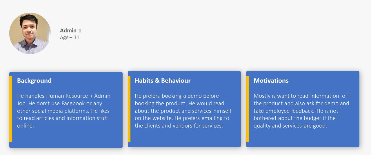
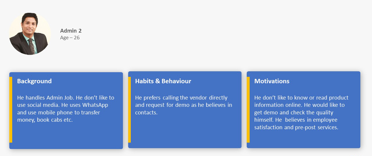
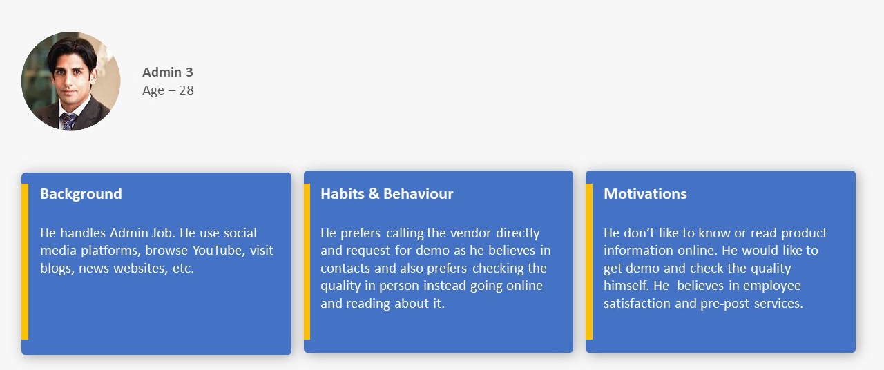
At the end of this qualitative survey, we got certain insights
The admins don’t like going through the  lengthy technical specs online for details and they prefer calling a sales executive for a direct demo.
They prefer calling a sales executive for a direct demo
After the user interviews we ran a quantitative survey for more insights. After collating both the data we got
It is noticed that our users are more interested in calling the vendors and checking the quality of the product through Demo and also getting employee feedback. – We should use CTA such as “Get a Free Demo” and “Request a Call Back” to attract our users.
Our Target Group mostly fall under 25-35 Age group (also seen on Google Analytics).
Also, user is Tech Savvy and know how to browse on mobile and desktop.
Our communication strategy should be as per our Target Group as they have very particular
and specified usage of words while talking about our products like Budget, Quality, Employee Satisfaction/Feedback, etc.
It was seen that our TG was more interested in knowing about the features of the product.
We should have Product Explainer videos and 3D Isometric feature of the product.
We also did in-depth analysis of Google Analytics Reports and In Page Insights. By deep diving in the reports we found that
The top most visited page and the most searched keyword is the Vending Machines. The user want information on the vending machine but the seems that the user is not convinced. The users are switching tabs and looking for more info.
The product range page looks blank and lacks visual appeal. There are no clicks found on In Page Insights, as there is no CTA or product to be seen.
The website lacks trust factors like Testimonials, Features & benefits, etc. to be convinced to fill up the lead form.
There are no decision making factors seen on the pages like CTA at every intervals.
However, we also had our challenges
HUL wanted to promote Maestro only to
organisations with more than 300 employees
Identify ways to educate the admins
about the cool features of the dispenser
User Behaviour for Consideration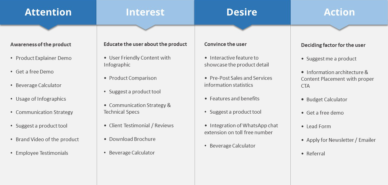

Sitemap Creation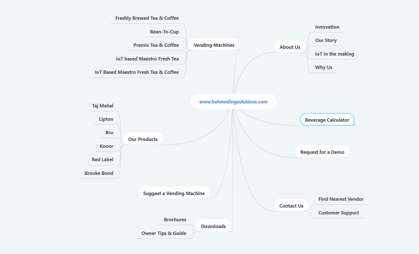

Solution & Case Study: