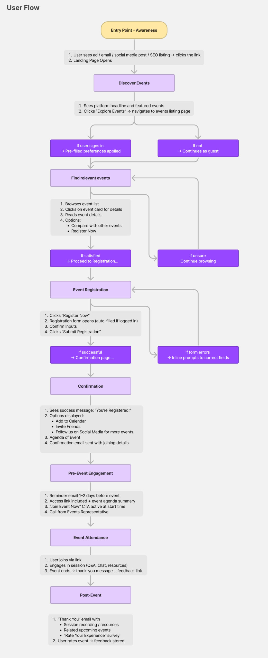
QS Top Universities Events give students a chance to connect with and learn more about universities all around the world. The students can meet the University Rep, Network with Alumni and students of similar interests and discuss their questions.
To comply with my confidentiality agreement I have eliminated and reserved confidential information.
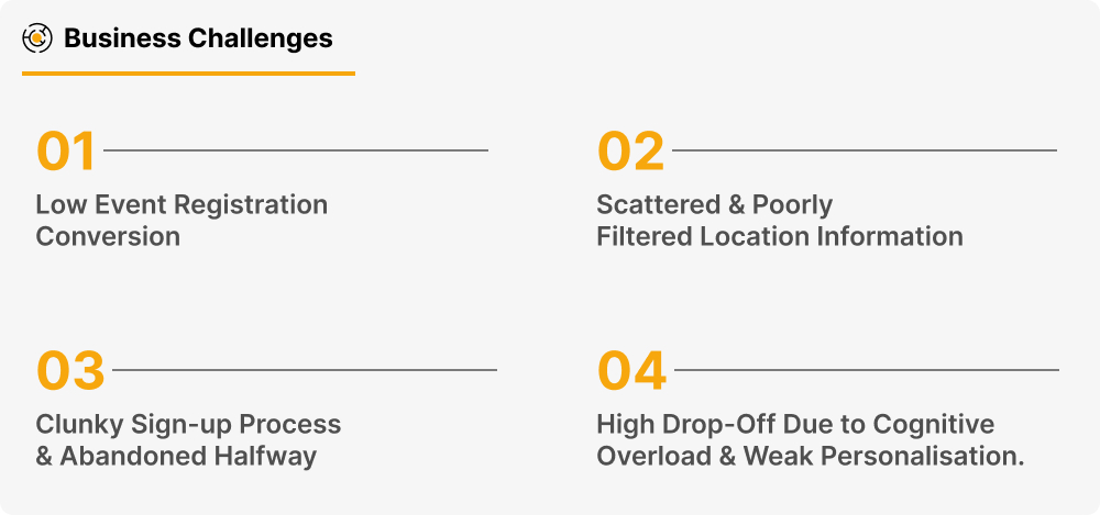
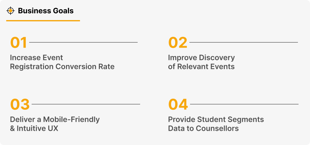
Project Brief:
With the Acquiring Traffic to QS Events Landing Page project, we were also looking at optimising the current landing page as a quick win and revamping the page with a broader scope.
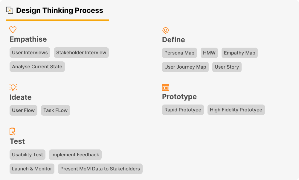
Role & Responsibilities:
I was a part of this project to re-design the QS Top Universities Events Landing page and Event Registration process.
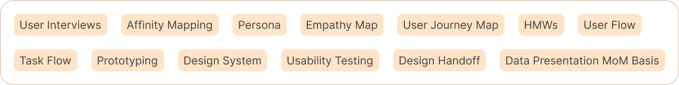
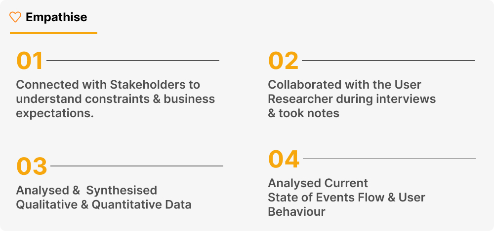
User Interviews:
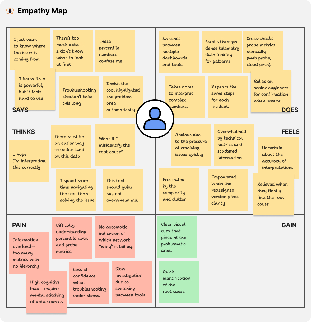
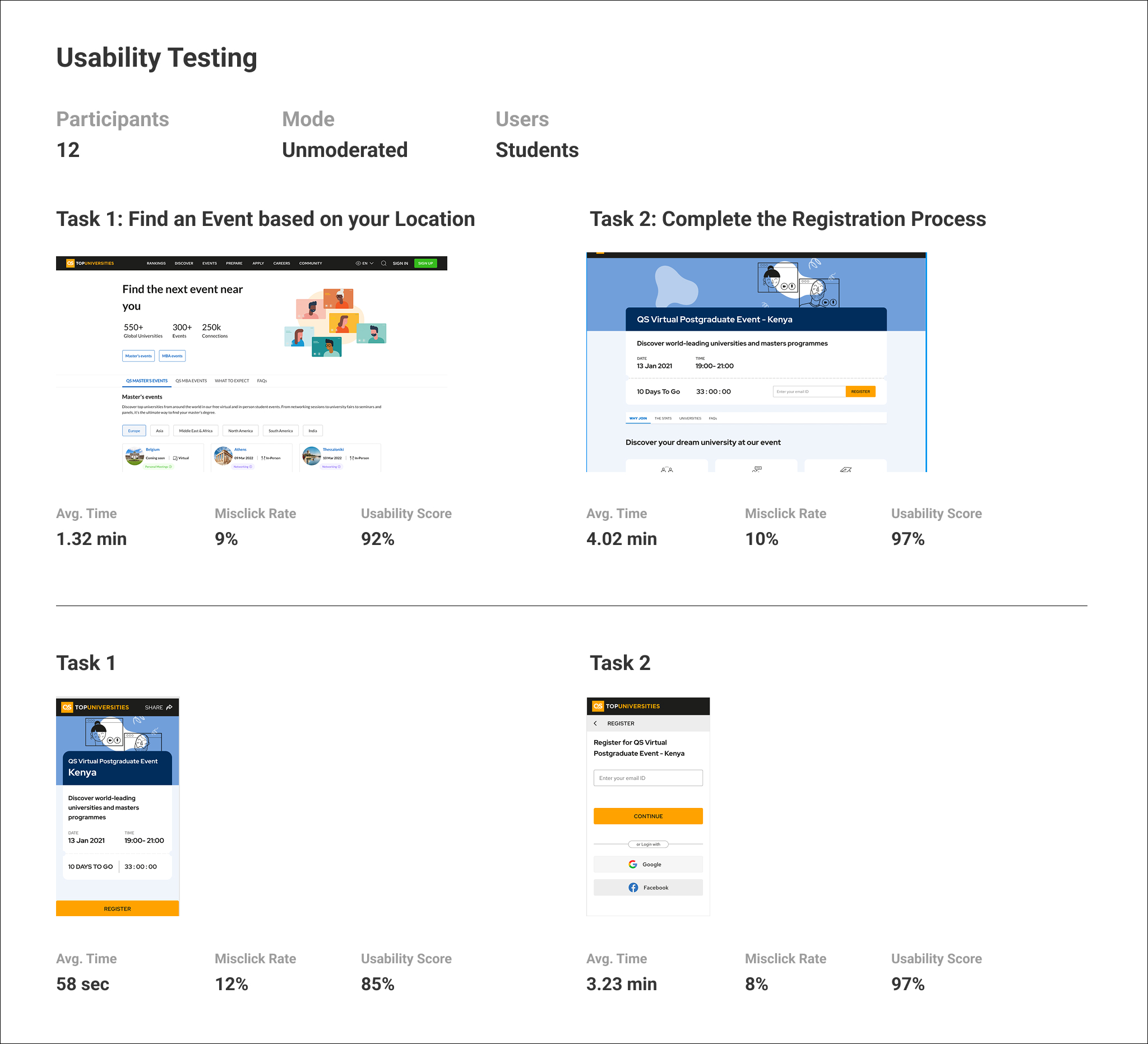
Along with the User Researcher, we interviewed 12 Students Across the Globe – who were seeking guidance for higher education abroad.
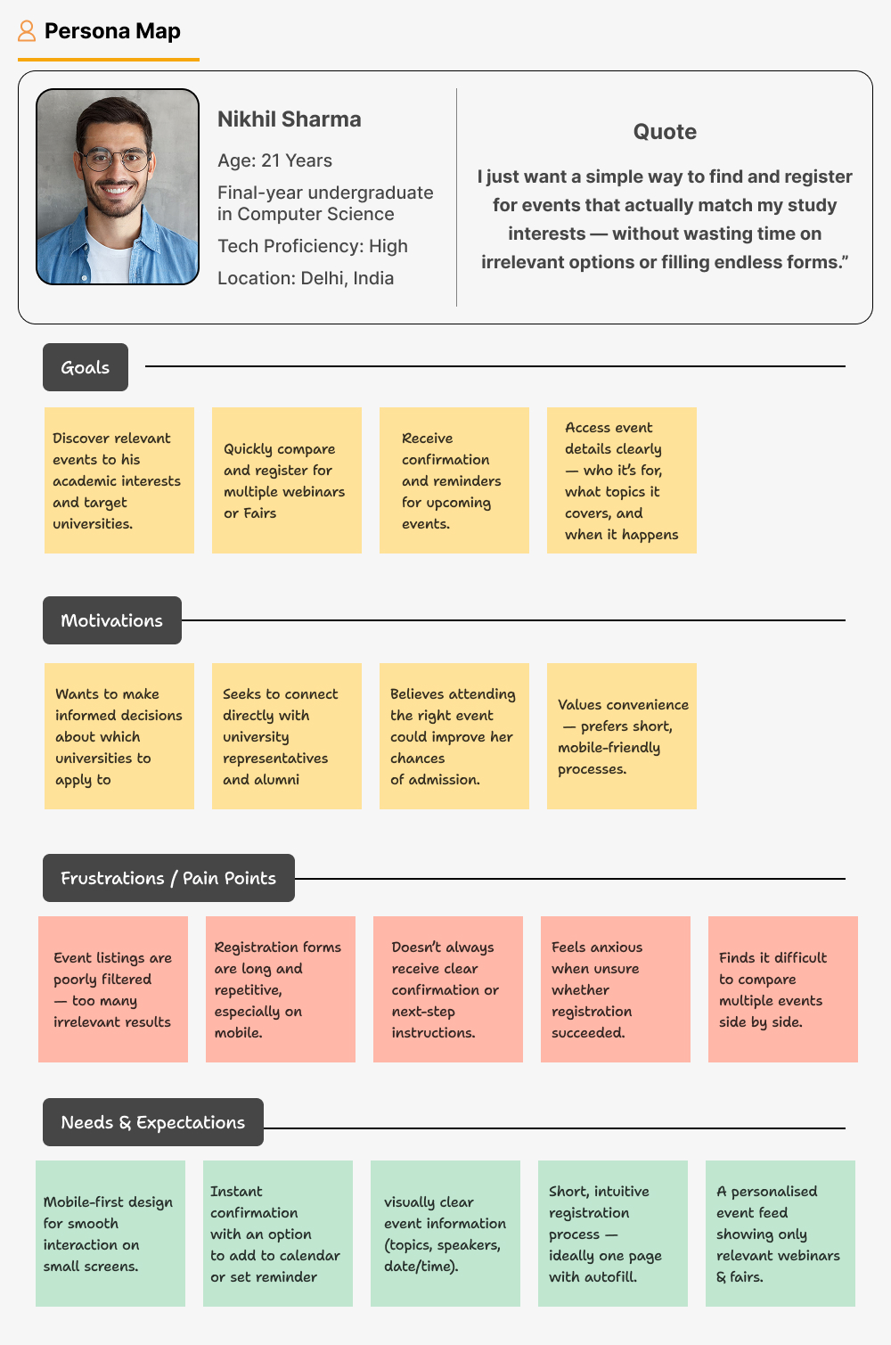
User Journey Map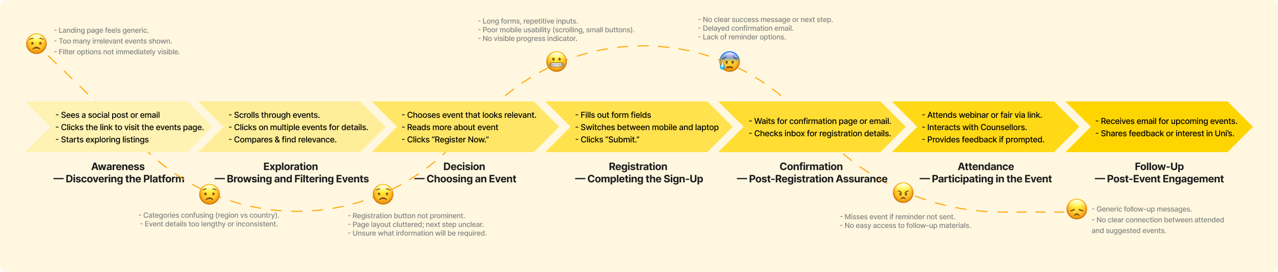

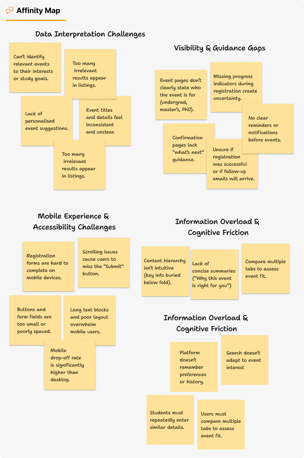
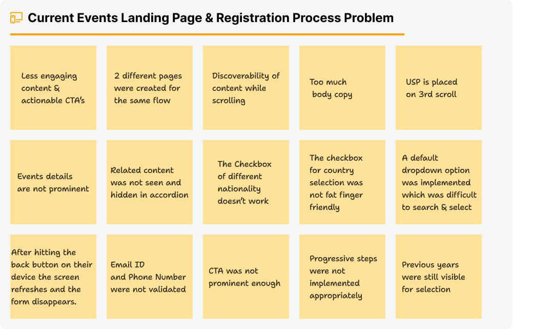
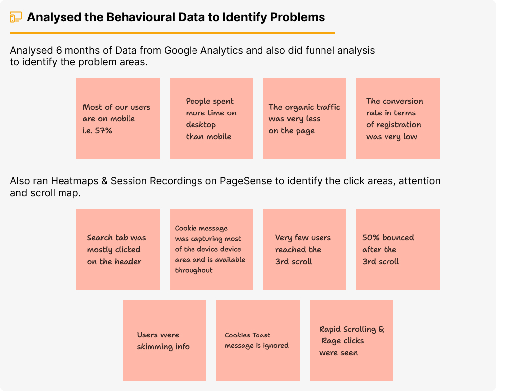
Conducted Heuristic Evaluation Old Events Listing page and Registration Process
 Ideation
- Facilitated Brainstorming Session and Data was presented to the stakeholders
- We were able to collaboratively come up with ideas through problem statements and HMWs
- Coming up with ideas and creating themes
- Voting ideas and prioritising them on Impact Effort Matrix
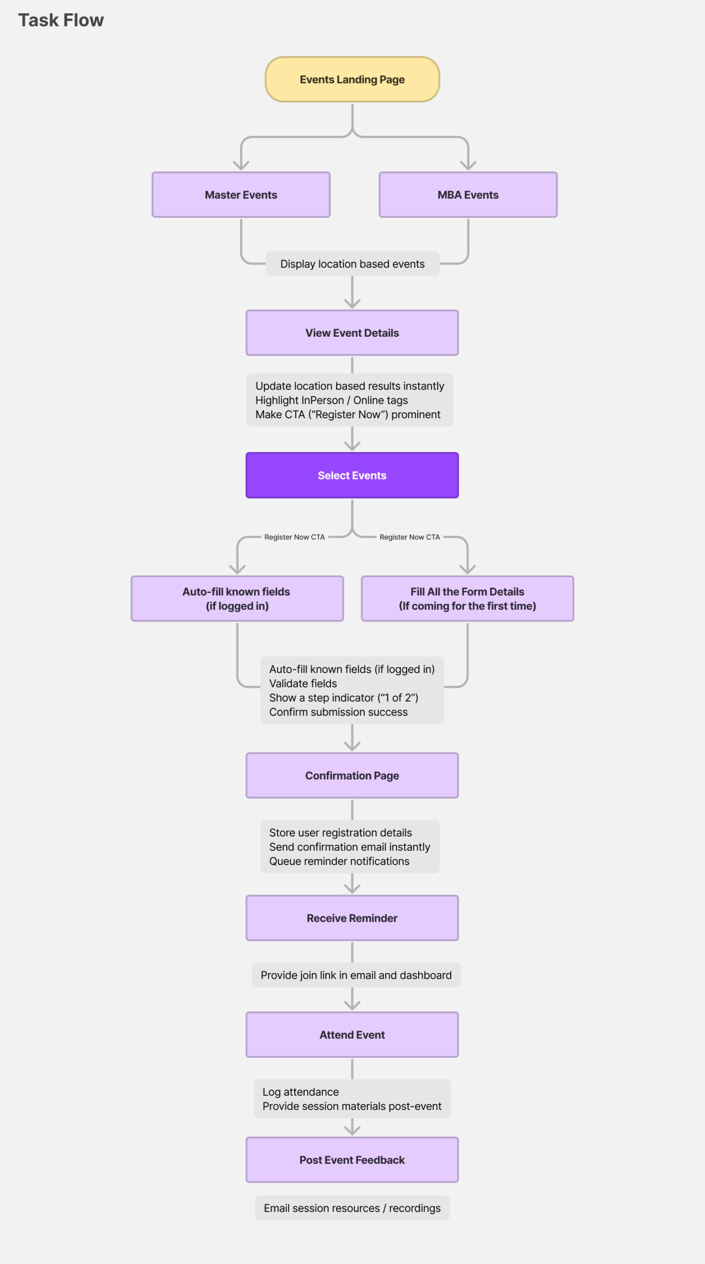
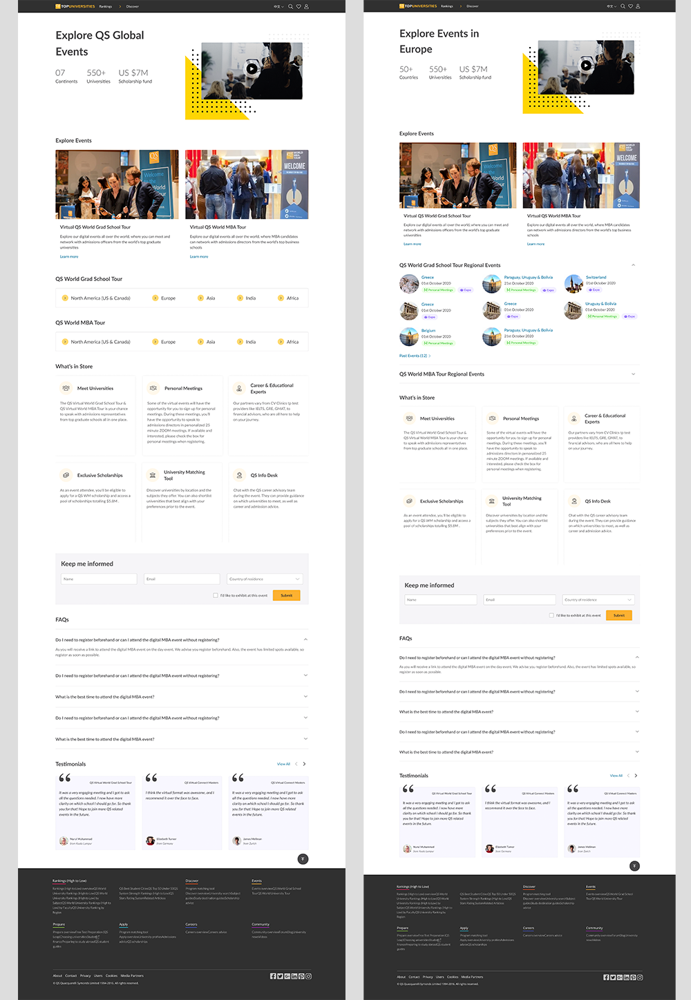
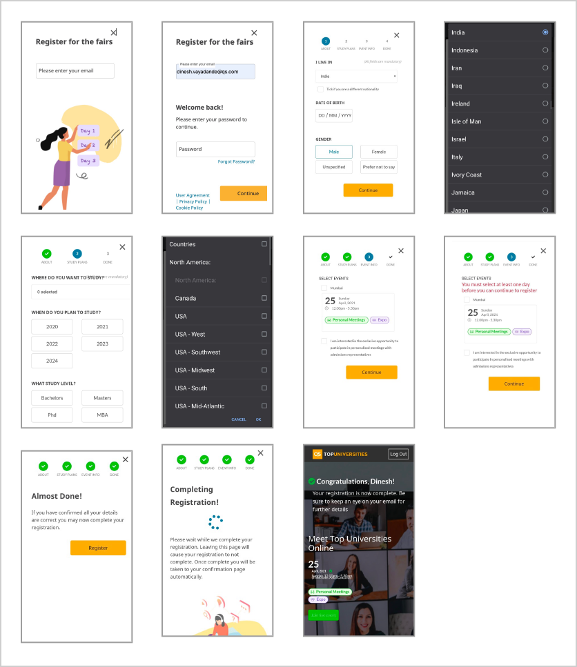
Prototype – New Events Listing Page and the Registration Flow
Low-fi designs were created and discussed internally to validate the hypothesis gathered through the Qual and Quant data. The team discussed and debated the design and the content hierarchy.
Desktop Design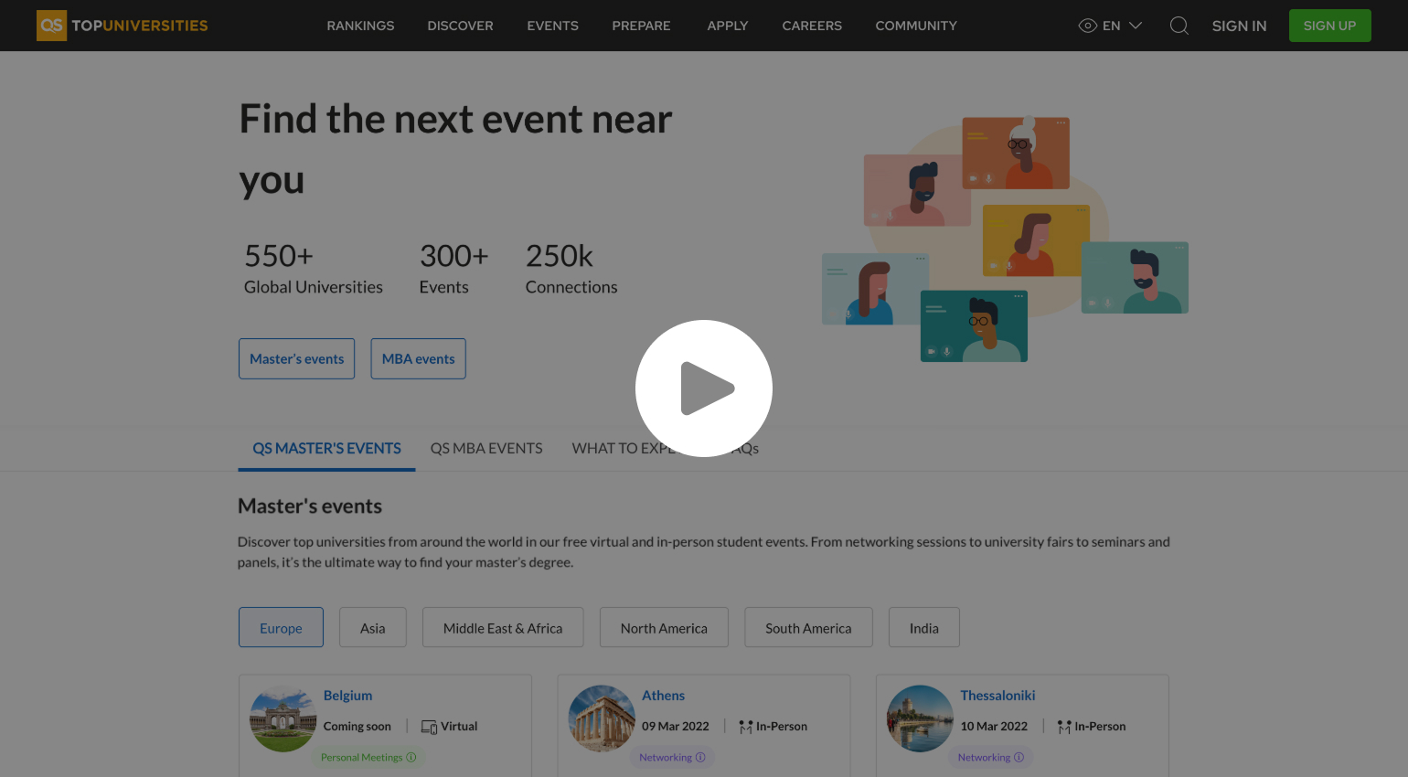

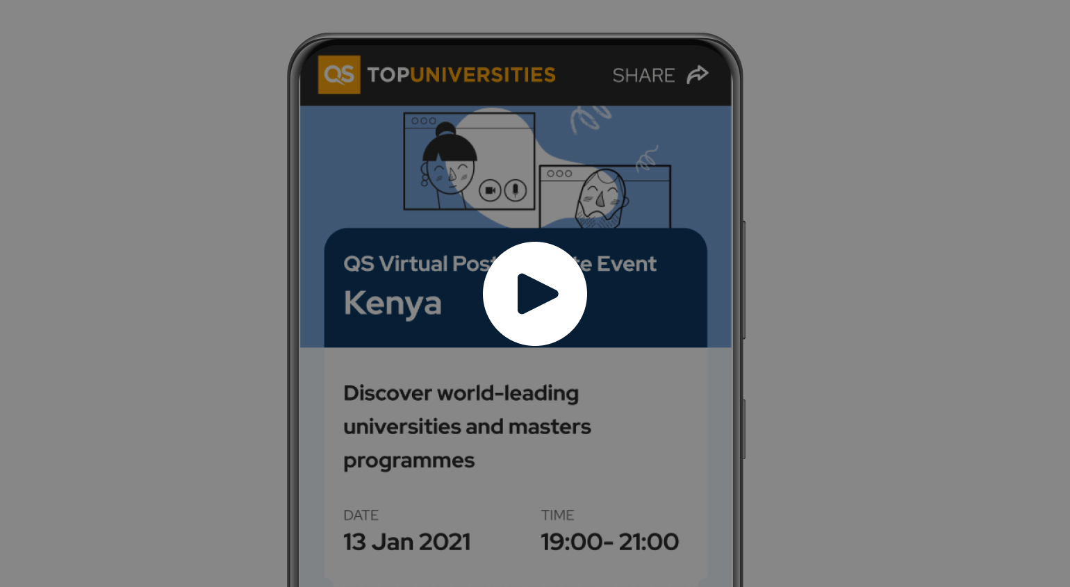
Mobile Design
 Usability Testing
 After the launch of the Regional Events Landing page, we saw a positive change in the data. The data was captured on month-on-month basis and shared with the stakeholders.